Bank of China Hong Kong
This Way to Retail Banking
Retail Identity, Signage & Environmental Graphics
Retail visual identity and signage environmental graphics design for a bank with the highest number of branches in Hong Kong.
Ways & Means
‣ Brand strategy
‣ Signage communications system
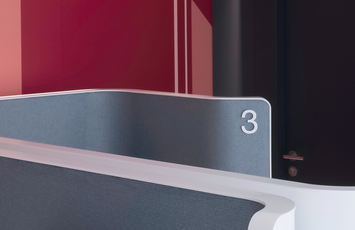
‣ Signage system and graphics
‣ Production artwork packages
Shaping a bank’s retail customer experience
When the bank with the highest number of branches in Hong Kong decided to launch its first retail banking flagship in Radio City, Causeway Bay, the obvious touching point of a well thought through and aesthetically striking retail system that can shape, inform and direct the customer experience was missing. That was the extra mile Springtime ran to convince the client that whatever they decided on, its was essential for BOCHK to develop a branded retail identity system.
More than meets the eye
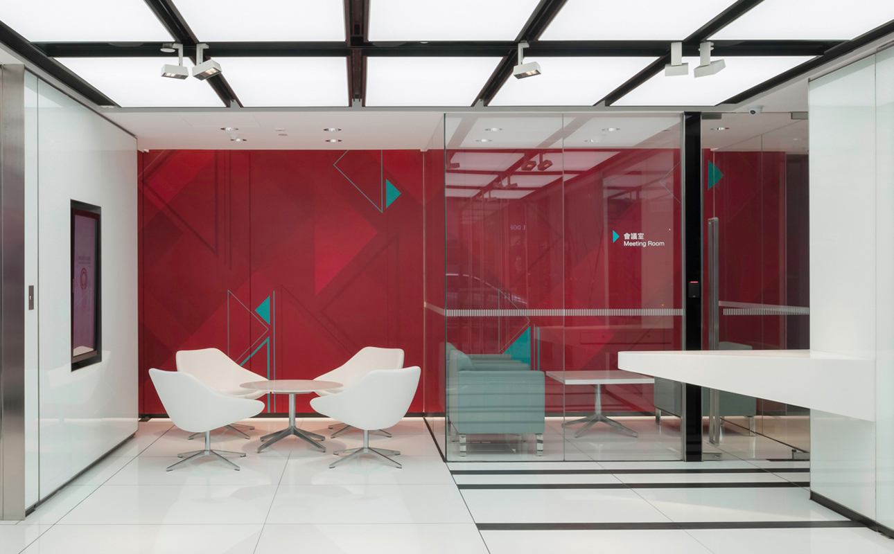
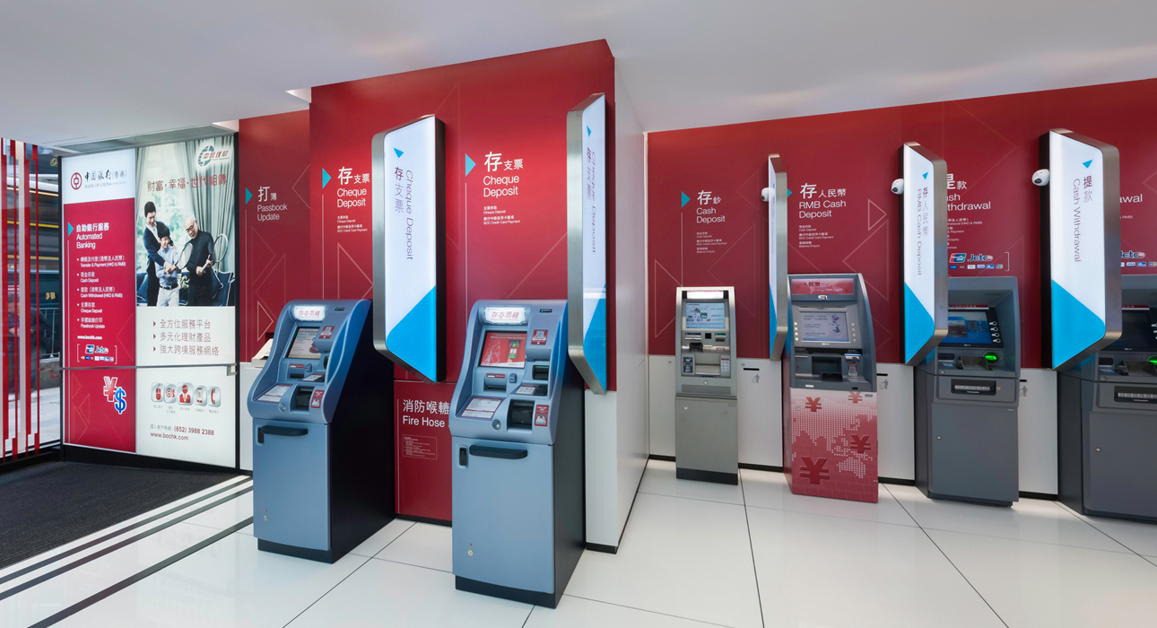
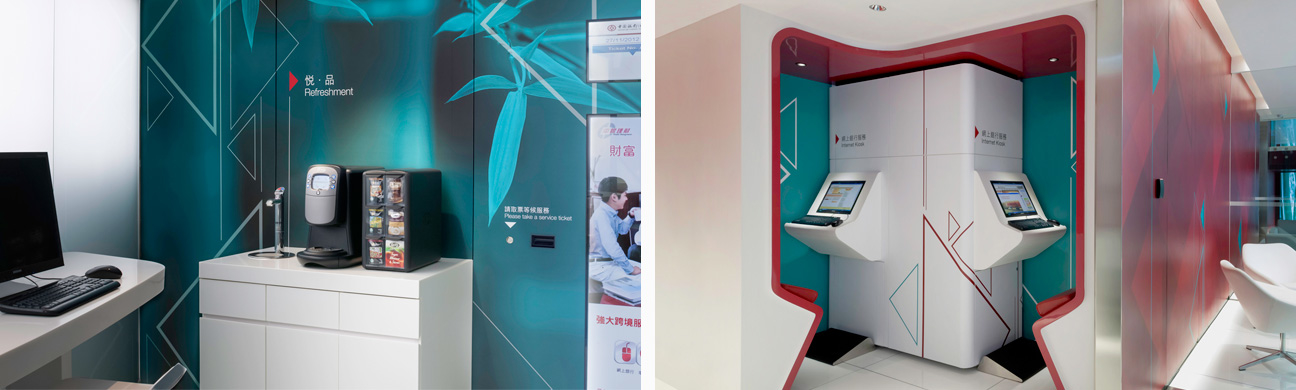
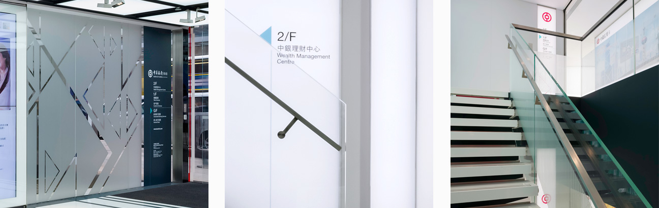
Working with the lead architects, we applied I M Pei’s iconic architectural motif of triangles to develop a graphic language that branded its retail environment and became its Retail Visual Identity. The same visual language was extended to create schematic coloured illuminated floor to ceiling murals which transformed into branded walls in the customer area and incorporated into direction and information signs.
Form and function merged seamlessly in the graphic strategy for the brand where it became the identifying visual presence of BOCHK. The vivid graphic visual language developed to support a new retail identity was leveraged to create a signage system that was unified and consistent across all applications.
It was so effective and well received that BOCHK adopted and expedited the roll out programme across all 200+ branches for maximum impact.
CK Jeans
Design, Implement & Roll
GODIVA
Opening Windows To Life’s Sweet Moments